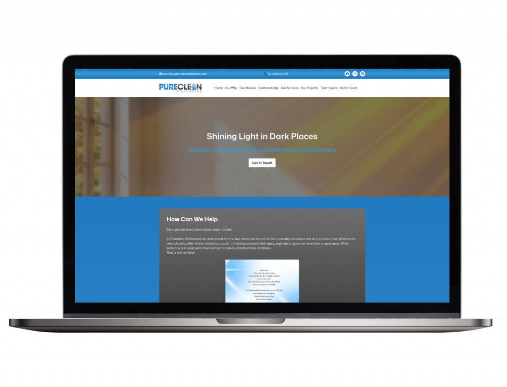
We worked with Kate Jervis from PureClean Bio Hazard to design a website for her biohazard cleaning company.
Kate wanted a one-page WordPress website which included her logo and brand colours. As her logo included gradients we used a blue gradient for the website background apart from the contact form area where we have used a just a blue background colour. For the content boxes a grey gradient is used for the background and for the text colour throughout the website white is predominately used so that it stands out against the background.
The website includes a navigation menu at the top, which when clicking on an item takes you to that specific section on the page rather than to a seperate page like a multi-page website would.
In terms of features, there is a hero image at the top with text and a call to encourage people to get in touch, content boxes with and without images, a bulleted list of the services, a gallery with before and after side by side image comparisons which use a slider in the middle so you can easily compare the before and after, details of accreditations, testimonials with a toggle feature allowing you to read more testimonials and a contact form.
We will continue to support Kate as and when needed with making changes to her website such as adding new before and after photos to the gallery.


